|
|
Post by Loogs on Oct 26, 2011 21:49:27 GMT -5
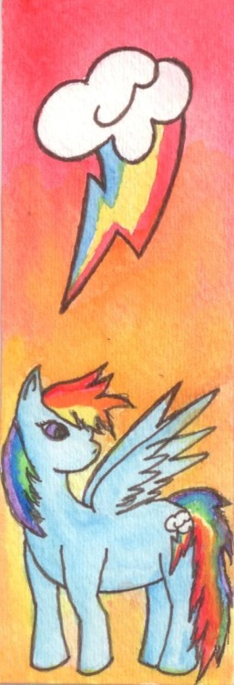
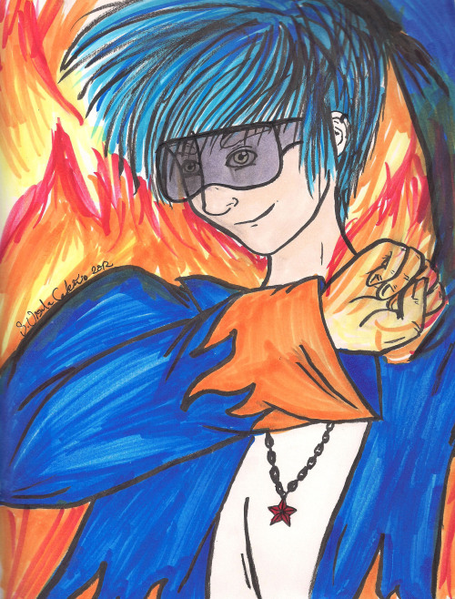
yeah, In Rainbowstuck, in which two things that I love very much (Homestuck and Radiohead) combine.
Karkat is next.
|
|
|
|
Post by Loogs on Jan 6, 2012 23:55:02 GMT -5
|
|
|
|
Post by Loogs on Jan 16, 2012 1:16:32 GMT -5
|
|
|
|
Post by Loogs on Feb 1, 2012 21:20:25 GMT -5
 i did one of those hourly things today |
|
|
|
Post by Beelzebibble on Feb 1, 2012 21:28:33 GMT -5
You mean you did one EVERY HOUR??
|
|
|
|
Post by Loogs on Feb 1, 2012 21:59:38 GMT -5
you're supposed to, but i was busy today so i couldn't. i might go and retroactively write one for each hour though. it was a fairly interesting day.
|
|
|
|
Post by Loogs on Mar 28, 2012 17:15:42 GMT -5
 im comics |
|
|
|
Post by Loogs on May 2, 2012 22:54:48 GMT -5
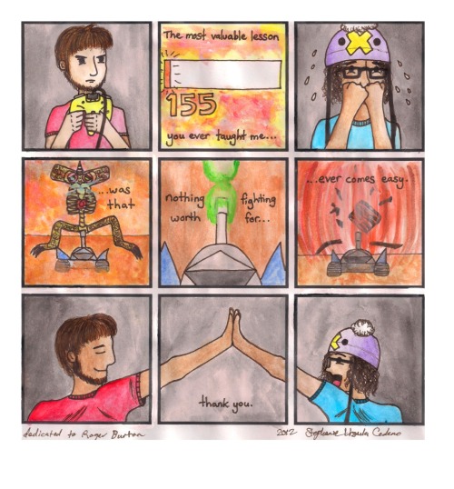
OH HEY GUYS SO I MADE A MINICOMIC WITH A FRIEND FOR FREE COMIC BOOK DAY 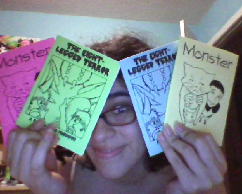 it's double-sided so you just read one comic and flip it over to read a whole new story! WOW TOTALLY RADICAL if anyone wants one just paypal me a whole dollar to cover mailing it and i'll send you one |
|
|
|
Post by Ninety on May 3, 2012 9:25:52 GMT -5
postage is only 88¢ though!  |
|
|
|
Post by Loogs on May 3, 2012 12:25:50 GMT -5
gotta make dat ca$h money dolla dolla bill y'all
|
|
|
|
Post by Beelzebibble on May 3, 2012 16:25:19 GMT -5
|
|
|
|
Post by Loogs on Nov 15, 2012 18:25:20 GMT -5
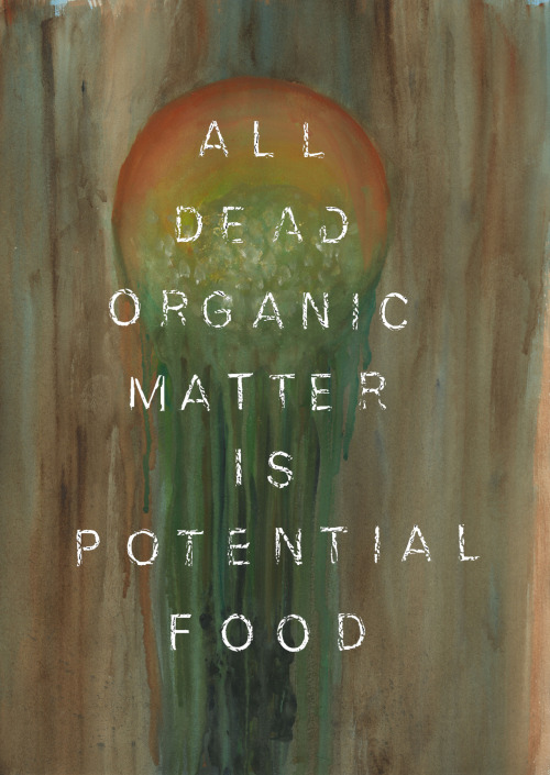 just showing off the fruits of my art school labor i chose decomposing fruit as my subject matter |
|
|
|
Post by Ninety on Nov 17, 2012 2:27:57 GMT -5
I like the painting itself but the text makes it feel like one of those KEEP
CALM
AND
____
ON posters/t-shirts/paintings/mousepads/coffee cups/bumper stickers. Also, I'm not really feeling the message of the text. Get rid of the text and I'd dig it a lot. |
|
|
|
Post by Loogs on Nov 17, 2012 9:01:08 GMT -5
i really hate those posters i really wish people would realize that they've been overplayed since forever ago and stop making variations on them. the original was cool and it's a shame i can't stand it now because theres like 1275895080 different parodies of it the text was a part of the assignment here it is textless 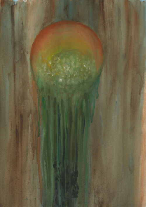 |
|
|
|
Post by Loogs on Dec 5, 2012 11:37:47 GMT -5
 WIP. i'll add color to it soon, probs when i'm not drowning in finals |
|
|
|
Post by Loogs on Dec 31, 2012 8:37:53 GMT -5
  you've come a long way, kid. happy belated 8th birthday, hector |
|
|
|
Post by Loogs on Jul 19, 2013 19:22:36 GMT -5
 i done did a cool thing |
|
|
|
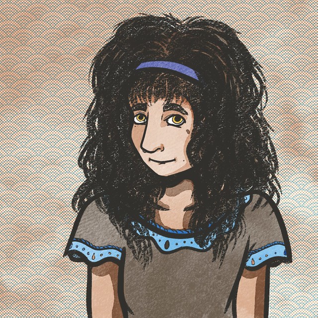
Post by Loogs on Jan 3, 2016 23:43:41 GMT -5
 idk where to post stuff anymore. here's an updated Miko for 2016. idk dude |
|
|
|
Post by Loogs on Jan 6, 2016 1:44:09 GMT -5
 I may not finish it tonight but here's a WIP of my next quick portrait :V |
|
|
|
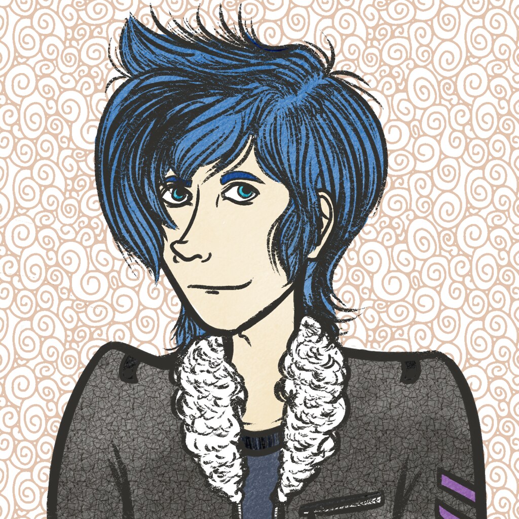
Post by Loogs on Jan 6, 2016 2:39:31 GMT -5
 a wild yoshi appeared what will you do |
|
|
|
Post by Beelzebibble on Jan 6, 2016 7:40:39 GMT -5
Love that linework on the hair! It's almost got a woodcut look.
|
|
|
|
Post by Yoshimitsu on Jan 6, 2016 16:34:49 GMT -5
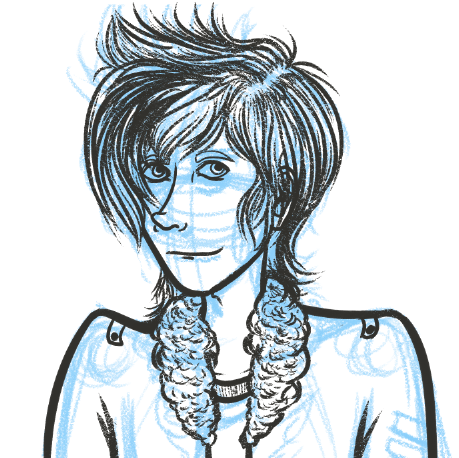
Okay so 'cause it's my character, here we go!
PROS:
You nailed his hair colour spot on - that's the exact shade of blue I envision for him
I dig the expression, you've nailed that too. It's the sort of sarcastic confidence that he embodies
Also the blue eyebrows, which is something I'd never actually thought about but since his hair is blue, it makes sense for his eyebrows to be blue too (I am definitely not thinking about this further than the eyebrows
The anatomy is actually much better than most manga I've read, it's damn near actual human proportions in the face
CONS:
(these are mostly because I think I might not have portrayed Yoshimitsu's appearance define enough in my writing)
The hair is less spiky than I would envision, it's more of a sweep-fringe and faux-hawk than actual spikes
The neckline on the t-shirt is definitely a failure on my writing style, since I always see Yoshi in a v-neck
I am loving that you picked up on the black leather jacket with white faux-fur collar and cuffs, but I'm not really feeling the purple stripes on the arm? It's a super nit-picky thing of mine
|
|
|
|
Post by Loogs on Jan 6, 2016 16:42:27 GMT -5
thanx for the feedback yall! I'll explain my process a bit further--I actually based the fashion heavily on your sprite (where it's not that readily visible that it's a V-neck)-- and then I took a few liberties with the design, namely adding the chevrons. I've been going with a much more subdued aesthetic as a result of leaning heavier towards slice-of-life stuff and away from the older shounen fantasy elements from when I was younger. I'll keep all these points in mind for all future Yoshi renderings  ETA: i think chevrons actually point the other way OOOOOOPS......... |
|
|
|
Post by Loogs on Jan 10, 2016 20:58:50 GMT -5
 it's a Pleiades I guess?  ? |
|
|
|
Post by Loogs on Jan 12, 2016 13:37:11 GMT -5
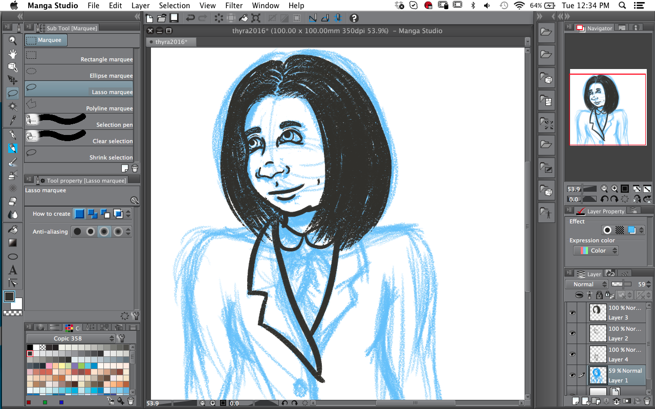 another WIP shot??? say it ain't so! |
|
|
|
Post by Loogs on Jan 12, 2016 14:19:30 GMT -5
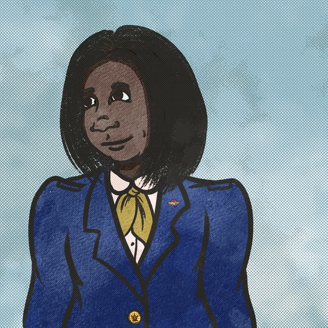 it's a thyra?? i guess?? i never feel like these are quite finished but i don't wanna overwork it @lee: idk the aviators didn't feel right for this one but lmk and i can do a version with aviators on |
|