|
|
Post by The Evil Biscuit on Sept 28, 2011 10:01:54 GMT -5
Okay, not the EXACT pose, but similar. Leaned back, legs out, arm behind. I know you were pretty disappointed with Rhys's legs in that position, so it would appear you've fixed that.
By the way, does Waylon's longcoat qualify as a Badass Longcoat?
|
|
|
|
Post by Beelzebibble on Sept 28, 2011 10:03:00 GMT -5
Perhaps if he is still wearing it in the future, it will be.
|
|
|
|
Post by Loogs on Sept 28, 2011 15:53:16 GMT -5
pohatu what do i have to do to get a drawing from you
do you want monies
do you want a 50-page long RP/fic
boobs?
also deceptacon is the best song
|
|
|
|
Post by Yoshimitsu on Sept 28, 2011 16:02:32 GMT -5
Maybe 'cause you don't critique him much? ;3
About the Yoshi/Illiana drawing, I want to start by saying I don't hate what you did with Illiana! I quite like it, it gives her a very casual look which is her standard look most of the time (except when at the South Pole). I think her curvature is very effective, and her breasts aren't Electrode proportions so she escapes the Sue area (would that even be a Sue thing?). What I mean is, her body shape and proportions are very well done and very close to what I imagined for her! Her boots are awesome, I want some in real life. I think my only issue with Illiana is that her body's facing one way and her legs another? It's a bit strange to look at, 'cause Yoshi's next to her with his body not twisted.
Yoshi's hair is pretty much spot on for what I described, and I like the addition of the sunglasses, it really shows the divide between his bangs and his spiky top of hair. His clothes are perfect, and it's good to see him drawn so thin (he's described as thin but toned, not muscley). I've already said about the vial but that's not really an issue all things considered. The boots are also awesome, would like a pair of those too. I also adore the addition of the necklace and how it's not a loose one (canon fact: he does wear a necklace with a sapphire pendant on it). The more I look at it, the more I like it.
Will give more for other drawings at some point, just wanted to say those for now.
|
|
|
|
Post by ch00beh on Oct 1, 2011 22:30:27 GMT -5
this photugraphy session was awful.
|
|
|
|
Post by Beelzebibble on Oct 2, 2011 1:42:25 GMT -5
That's okay. Why?
|
|
|
|
Post by ch00beh on Oct 5, 2011 1:05:59 GMT -5
not enough of my characters in it.
|
|
|
|
Post by Beelzebibble on Oct 25, 2011 12:56:04 GMT -5
pohatu what do i have to do to get a drawing from you Maybe 'cause you don't critique him much? ;3 Incidentally, I don't think that's it -- I'm pretty sure the real reason is that Loogs and I have barely RPed together yet, with only August Luncheon marking any significant direct interaction between characters of ours so far. If you break down the list of characters with drawings in this topic, there's a grand total of two characters who (a) belong to other people and (b) have never yet been in an RP where I was also at work. Those are Rance -- who had an obvious "in" anyway, due to association with Huckabee -- and Mickey. You can stretch things a little by tossing Jacqueline and Thyra in there, since even though I've nominally worked on RPs with both of them, I don't think I've ever had a character interact with them directly (right? Am I forgetting something with Thyra in LTR?). Plus, there are about three characters I'm trying to reel in for the next batch who haven't been in any RPs I was a part of, including one who hasn't even been in any RPs at all yet! But even so, that's a pretty scant minority. Usually the way I get attached to other people's characters is by playing off those characters in the RP. So obviously Loogs you and I need to RP together more. |
|
|
|
Post by Beelzebibble on Jan 5, 2016 17:20:48 GMT -5
 You look a little stressed out, there, buddy.  This is probably more hair than Lee was imagining, but believe me when I say it's less hair than I was imagining. As far as I'm concerned, Almudena has big hair. Big hair. Also, I don't know where the boxing gloves came from. I bet Lee's gonna say that wearing boxing gloves would inhibit her powers. That's fine! Maybe that's the point! Maybe she's just engaged in a good ol' sparring match with a nonpowered partner! Got to keep in shape.  Wasn't originally planning to draw this guy, but I couldn't resist when I realized what a great shape contrast he would make with Almudena. I wanted her profile to be very bottom-heavy and his very top-heavy. I'm pretty happy with the result. |
|
|
|
Post by Tout-Perd on Jan 5, 2016 18:03:11 GMT -5
I can't give my review for Almudena just yet because that might be spilling the beans for Illustrated, but I can say I'm glad you announced this in both threads so I can like it more than once.  It's really nice to see your action-pose chops get some use. As for the boxing gloves, it could go either way- It wouldn't supress her power, but Almudena can choose to throttle back her powers and just straight punch people. Not sure when it comes to ORP, but in her original setting, Paisanos, she actually had a tendency to fuckup her hands by punching too hard, since normally her power takes the brunt of the impact so she can just swing for the bleachers. In ORP, she's had her power for longer, so it's entirely possible she's adjusted and compensated for that by now. But the boxing gloves are a great prop for conveying her personality and modus operandi, so they thoroughly get my approval. All in all, I'm loving this new tablet-done stuff. Before, one of your biggest issues was how to do shading in a fairly monochromatic style, which led to some issues on occasion, but this has shored it up majorly, and the anatomy and proportions, your other occasional weak spot, has really been improved, too. This is some crazy good stuff, and your art style's really evolved (you must have grinded up to level 36 or something). That Terrian may very well be my favorite image you've ever penned , since it's just so incredibly utterly expressive. There's so much emotion packed into all of these, and it really draws the viewer in. |
|
|
|
Post by Beelzebibble on Jan 5, 2016 18:09:30 GMT -5
Whoooo It's all worth it for the Lee feedback. Yeah, I loved the personality of the old crosshatch-heavy shading, but as some of Mark's art demonstrated, it didn't translate well to the tablet. So I'm taking it in a new direction now, while trying to maintain fidelity to my old style with the overall linework. I'm really glad you like it. Thanks for the response! |
|
|
|
Post by Loogs on Jan 5, 2016 20:25:01 GMT -5
This is a pretty good comeback tbh
I'm curious to know what program you're using, though. Manga Studio 5 lets you use screentones very easily, I've found that's a nice way to do halftones on a drawing. Best part is, it's $40 full-price (and as low as $15 when it goes on sale) and I can't recommend it enough
also how do you feel about an art trade
|
|
|
|
Post by Beelzebibble on Jan 5, 2016 23:04:27 GMT -5
I just use Gimp. As long as it's got layers, I'm good to go. Manga Studio 5 sounds awesome and I'll definitely keep an eye out, but I'm not sure if I'd want to just apply a halftone texture. Feels like that'd lose something.
i have no idea which character of yours you'd request for this art trade
|
|
|
|
Post by Loogs on Jan 5, 2016 23:32:24 GMT -5
I just use Gimp. As long as it's got layers, I'm good to go. Manga Studio 5 sounds awesome and I'll definitely keep an eye out, but I'm not sure if I'd want to just apply a halftone texture. Feels like that'd lose something. MS5 gives you like a zillion different screentone options, you can use the preloaded set of halftone dot patterns, and there's also other textural effects you can use, as well as anything nifty you can find on the internet. You can even make your own patterns to use! Between that and the brushes I can't recommend MS5 enough i have no idea which character of yours you'd request for this art trade  question is what would you ask for also who's to say i won't psych you out and ask for halleyno who am i kidding you know who i'm asking for |
|
|
|
Post by Beelzebibble on Jan 6, 2016 17:31:04 GMT -5
but he's already next in the contest queue
|
|
|
|
Post by Loogs on Jan 6, 2016 17:38:01 GMT -5
but he's already next in the contest queue |
|
|
|
Post by Beelzebibble on Jan 7, 2016 12:05:01 GMT -5
 Forgive the indulgence that is his jersey number. It took a lot of restraint not to slap one more 6 on there.  Blaise. I dunno! |
|
|
|
Post by Beelzebibble on Jan 8, 2016 15:44:55 GMT -5
 This guy grew on me while drawing. I liked the detail of his upper body being wrapped in bandages, although I didn't take it all the way up to the nose like Shoni suggested, since that hindered the expression a little too much.  Yoon Mangjeol in something more like her August Luncheon outfit. Her arms should probably be veinier or wrinklier. But it turns out I don't know how to draw that and I'm not going to make her skin look hideous by trying. So Yoon is blessed with the arms of a twenty-five-year-old! Wow. |
|
|
|
Post by Beelzebibble on Apr 12, 2016 11:38:33 GMT -5
 Just gonna post this real quick before I come up with a hundred things I don't like about it okay bye |
|
|
|
Post by ch00beh on Apr 12, 2016 13:10:40 GMT -5
like the fact that he clearly is using glass ON A BEACH
i'm calling the coast guard
|
|
|
|
Post by Beelzebibble on Jul 16, 2016 21:32:07 GMT -5
 Updated Terrian with a better brush. I'll probably redo all the ones from this modern batch.  Some chick. I don't know if I've solved her hair, but the good news is, she probably switches hairdos often. |
|
|
|
Post by Loogs on Jul 16, 2016 21:48:09 GMT -5
Photugraphy HD remake yes very nice I take it that's the G-nib brush you're using with Clip Studio Paint? It's really working out for you, I think although you pull off the aliased look better than I had expected you to but it's still missing a je ne sais quoi that's keeping it from giving me the fuzzy feels of Retro Photugraphy, which had this warm analog quality to it like a nice old vinyl record My suggestion would maybe be to a) find a brush with a wee bit more crunch and texture to it or b) set a texture layer on top of it via overlay. Right now my problem is that it feels a bit too smooth and unnatural for the kind of hand you have All that aside, I think the inking work on the second one feels more refined and confident than the first one, where the line widths feel a little off and wobbly. I'm excited to see where this will go EDIT: so I took the Terrian drawing and threw on a texture layer to give you an example of what I'm talking about and holy shit it's a whole different ballpark 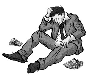 CONCLUSION: definitely look into finding textures to add to your drawings |
|
|
|
Post by Beelzebibble on Jul 16, 2016 21:53:58 GMT -5
I actually like the variable line widths in Terrian more than Isara. Growing up on Walt Kelly made me a total sucker for dramatically varying line widths. That man could ink like no other. I fucking assume you know who I'm talking about, but if not, here. Would have honestly liked to work more varying line width into Isara. |
|
|
|
Post by Loogs on Jul 16, 2016 22:00:58 GMT -5
Getting nice smooth brush ink work like that takes years of practice, speaking from experience, although there are ways you can set the stabilization on your tablet and/or digital media to help things a bit EDIT [HASH]2: so I looked at that sample I made again and realized the texture layer was actually a bit too bold and that's because I forgot to dim the opacity on it like I usually do with my texture layers:  CONCLUSION [HASH]2: use textures but also fuck around with the opacity a bit so they're not overpowering the piece |
|
|
|
Post by Beelzebibble on Jul 28, 2016 11:16:26 GMT -5
|
|
|
|
Post by Beelzebibble on Feb 9, 2018 16:36:11 GMT -5
 Deandre HD  This whole thing has secretly been a mission to see how many veteran RPers I can piss off by depicting their mains with slicked-back hair. No seriously, I'm sorry, but I can't get into the young guy with rock-star hair look. The dude's a king! I realized there's always been a trace of Jet Black in my visual conception of Valon, and I didn't try to fight that here. AngelicTragedy, I know you've said he actually is in his fifties, but you've also said he looks younger than that due to Aldra-Sa biology, so... if the only way you can deem this picture acceptable is to pretend that it's a look into the future when he's actually a hundred years old and looks fifty, then... I'm cool with that? |
|


 It's really nice to see your action-pose chops get some use.

