Post by Beelzebibble on Aug 15, 2007 17:59:21 GMT -5
Now that the website is back at full steam, it's time to decide which of Freewebs' many, many templates we want to use. Lee said back over here that something ocean-y would be nice, since it would complement the sandy look of the NeoExodus skin.
So I looked for blue and turquoise templates, and here are the best templates I found. In my opinion, of course. Anyone who thinks there are other good templates we should consider is free to pipe up. I picked the following four based on these criteria:
(1) The template had to be fall under Freewebs' "Blue" category (which also includes templates that lean more toward the turquoise).
(2) It had to fill the screen. Some templates only covered part of it and then left ugly white space around the edges. Yuck!
(3) Paragraph headers had to be easily distinguished from the main text. Not just a matter of my personal preference -- this is crucial for things like documenting RPs.
(4) I had to like it. Hey, I'm the one doing the work.
To start off, here's a sample of our current template, Black Green. It's tasteful, although I think the margins are way too narrow, and the image just doesn't strike me as Archie Exie-ish, if you get me. Still, I included Black Green in the poll for anyone who thinks we should just stick with it.
Elements Water is the most blatantly water-based of the lot, for those who really really dig Lee's beach suggestion. I like it, although it's just a wee bit painful to read the white text against the wave background.
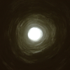
Neon Blue is hands-down my favorite, and easily gets my vote. A simple yet highly classy color scheme, and that little orb in the top right corner looks water-y. Better yet, this skin has a genuine sidebar like Black Green (instead of a... topbar like the other three choices), yet offers generous margins that would give the main content plenty of room to breathe.
Retro Aqua has some neat, kooky designs that bring Foster's Home to mind, but the pale teal and beige are a bit of an eyesore after a while, and I don't like how plain "ARCHIPELAGO EXODUS" looks surrounded by that awesome title border.
Waveform Aqua doesn't merit too much discussion. It's there, it's cool, and that's about all there is to say -- other than that the margins aren't as wide as the other options (except Black Green).
So I looked for blue and turquoise templates, and here are the best templates I found. In my opinion, of course. Anyone who thinks there are other good templates we should consider is free to pipe up. I picked the following four based on these criteria:
(1) The template had to be fall under Freewebs' "Blue" category (which also includes templates that lean more toward the turquoise).
(2) It had to fill the screen. Some templates only covered part of it and then left ugly white space around the edges. Yuck!
(3) Paragraph headers had to be easily distinguished from the main text. Not just a matter of my personal preference -- this is crucial for things like documenting RPs.
(4) I had to like it. Hey, I'm the one doing the work.
To start off, here's a sample of our current template, Black Green. It's tasteful, although I think the margins are way too narrow, and the image just doesn't strike me as Archie Exie-ish, if you get me. Still, I included Black Green in the poll for anyone who thinks we should just stick with it.
Elements Water is the most blatantly water-based of the lot, for those who really really dig Lee's beach suggestion. I like it, although it's just a wee bit painful to read the white text against the wave background.
Neon Blue is hands-down my favorite, and easily gets my vote. A simple yet highly classy color scheme, and that little orb in the top right corner looks water-y. Better yet, this skin has a genuine sidebar like Black Green (instead of a... topbar like the other three choices), yet offers generous margins that would give the main content plenty of room to breathe.
Retro Aqua has some neat, kooky designs that bring Foster's Home to mind, but the pale teal and beige are a bit of an eyesore after a while, and I don't like how plain "ARCHIPELAGO EXODUS" looks surrounded by that awesome title border.
Waveform Aqua doesn't merit too much discussion. It's there, it's cool, and that's about all there is to say -- other than that the margins aren't as wide as the other options (except Black Green).